#changelog#react#performance#ux#refactor

Six Fixes and One Honest Half-Measure

A code review found eight things wrong with my AI academy. I shipped six, declined two, and finished one only halfway — on purpose. Here's every change, why it mattered, and a plain-English explainer of the technology behind each one.

Part 2 — the rebuild log: six panels repaired, one deliberately left unfinished. Generated with Grok Imagine.
TL;DR

Eight review findings. Six shipped: scroll restoration, removing an empty state from 81 of 82 modules, lazy loading, a week's-path checklist, catalog wayfinding, and worked examples — plus a Markdown renderer that learned tables along the way. Two declined on purpose. And the performance fix is deliberately half-done, because I couldn't build-verify the risky half. This is the log, with the technology explained as we go.

01 — The review

Eight findings, and the two I argued with

Part 1 described AICademy as it stands: six courses, 82 modules, simulated employers, a module-scoped AI tutor. What Part 1 didn't say is that a few weeks after it was working, I put the whole thing through a proper code review — and the review came back with eight findings.

The useful thing about a review is that it doesn't care how attached you are to anything. But it can also be wrong, so the first job was checking the claims against the actual code rather than accepting them. Two of the eight didn't survive that check in the form they were written.

One finding claimed the flagship RAG course had features "switched on but broken." The code said otherwise: capstoneTracker: false, toolkits: false, no world file, and zero of its 30 modules carrying a mission or reflection. Not a bug — a course built to a deliberately different shape, before the newer courses invented those features. Another finding asked me to tone down the steampunk catalog for an "executive, certification-grade" audience.

A review tells you what's broken. It doesn't get to tell you what your product is.

Here's the full ledger, with what each one actually turned out to be.

02 — Fix #1

The page that opened halfway down

#1Scroll restoration on navigation
The problem

Click from a module page into the certificate page and you'd arrive already scrolled halfway down it — heading invisible, hidden behind the sticky top bar. It felt broken in a way that's hard to name but easy to feel: the app forgot you'd moved.

Diagnosis: useLocation() was imported in App.jsx — but nothing ever used it to reset scroll.
The fix

Ten lines. An effect that watches the URL path and, whenever it changes, sends the window back to the top. The smallest change in the whole review and arguably the biggest per-line improvement in how finished the app feels.

Explainer · single-page apps & routing

A traditional website loads a brand new document for every click, and the browser naturally starts you at the top. A single-page app like AICademy never reloads — it swaps the content in place and rewrites the address bar to match. Faster, but the browser doesn't consider it a "new page," so it helpfully preserves your scroll position. It's like changing the slide in a projector without moving the audience's eyes — they stay staring at where the bottom of the last slide was. Which means you have to move them yourself.

WITHOUT RESET sticky bar ↑ heading up here you land here ✗ scroll kept from the previous page WITH scrollTo(0,0) ON ROUTE CHANGE sticky bar heading visible ✓
03 — Fix #3

81 modules promising notes that didn't exist

#3Hiding an empty state instead of filling it
The problem

Every module displayed a Notes tab. Click it on almost any of them and you got: "No study notes published." The review flagged this, and checking the code made it worse than reported.

All six courses set a notesDir. Exactly 1 of 82 modules had a notes file. So 81 modules advertised a tab that led nowhere.

An empty state on one page is a gap. The same empty state on 81 pages is a message — it tells every learner the product is unfinished, on repeat, in six different courses.

The fix

The obvious move was to generate notes for all 82 modules. I deliberately didn't. Auto-generated notes would restate the objectives and resources already sitting on the Learn tab — filler that adds a click and no knowledge, and quietly devalues the one set of notes I actually wrote by hand.

Instead: a tiny manifest — a list of exactly which modules have real notes. The tab now appears only where there's something behind it. Today that's one module. When I write the next one, it's a one-line addition.

Explainer · empty states & the manifest pattern

An empty state is what an interface shows when there's nothing to show. Done well it's an invitation ("no tickets — nice work"). Done badly it's an apology, repeated. The rule of thumb: if a door leads nowhere on most floors of the building, take the door off, don't put a sign on it.

A manifest is just a small index that records what exists — like the contents page of a book, kept separately from the chapters. Rather than every page guessing whether its content exists, one list holds the answer, and the interface asks that list before offering the door.

BEFORE — 82 TABS, 1 HAS CONTENT … ×81 “No study notes published.” AFTER — MANIFEST DECIDES { 'agentic-ai-rag': [1] } one tab, backed by a real file — the other 81 simply don't render it
04 — Fix #8

Everyone downloaded all six courses to read one

#8Lazy loading — and the half I didn't ship
The problem

AICademy's course registry imported every course's content directly, so the build packed all of it into a single file. Open the homepage to glance at the catalog and your browser downloaded all six curricula — every module, rubric, drill and quiz — before it could show you eight cards.

One bundle, roughly 1.28 MB. Of that, ~1.1 MB is course data and ~135 KB is component code.

That's the difference between a site that feels instant on hotel wifi and one that doesn't — and my audience includes people on locked-down corporate laptops and mobile connections.

What I shipped

The page components are now lazy loaded: the code for the dashboard, module page, labs, journal, certificate and the rest is fetched only when you actually navigate there. That defers about 135 KB of components plus a 56 KB lab-data file out of the first load.

What I didn't

The bulk — the ~1.1 MB of course data — needs the registry to load courses on demand, which means changing the core data path that the course shell, the catalog and the global tutor's retrieval all depend on. It's the one change in this batch with real breakage potential, and I hit a hard limit: I couldn't run the build to verify it. The project's dependencies are compiled for macOS and my working environment couldn't execute vite build, so I had no way to measure the result or catch a runtime break.

Shipping a risky refactor you can't build-test isn't confidence. It's gambling with someone else's site.

So I shipped the safe half, and wrote the risky half up as a spec to execute in a build-capable session. Honest partial beats confident broken.

Explainer · bundles, Vite, and lazy loading

Modern sites are written as hundreds of small files, but browsers hate fetching hundreds of files. So a build tool — here, Vite — compiles everything into a few optimised files before deployment. That process is "the build"; the output is "a bundle."

By default the bundle is one big parcel. Code splitting cuts it into chunks, and lazy loading means a chunk is only fetched at the moment it's needed. Think of a restaurant that currently brings every dish on the menu to your table before you've ordered. Lazy loading is just… taking the order first.

The catch: splitting is easy for code, harder for data that many parts of the app read at once. That's why one half shipped and one half didn't.

BEFORE — ONE PARCEL everything.js 1.28 MB downloaded before the first card paints split AFTER — LOADED ON DEMAND catalog + shell loads immediately module page · on click labs + lab data · on click journal, certificate · on click STILL EAGER — THE BIG ONE ~1.1 MB course data needs an async registry refactor — deferred until it can be build-verified
05 — Fix #5

Seven tabs and no idea which one is next

#5"This week's path" — turning tabs into a sequence
The problem

A module page offered seven tabs — Learn, Project, Drills, Mission, Reflect, Tutor, Module Test. All equal, all silent. Nothing conveyed that they're meant to be walked in order, and nothing showed how far through the week you were. A learner returning on Thursday had to reconstruct their own position from memory.

The fix

A numbered strip above the tabs: Learn & objectives → Do the project → Practise drills → Apply at work → Reflect → Take the test. Each step links to its tab, highlights where you are, and — critically — shows a real completion state wherever the app already knows the answer: objectives ticked, mission logged, test passed.

It adapts per course too. The steps are filtered against the tabs that course actually has, so the RAG course (no mission or reflection tabs) shows a shorter, correct path rather than dead entries.

Explainer · wayfinding & honest progress

Wayfinding is the discipline of helping someone know where they are, where they can go, and how far they've come — borrowed from architecture, where it's the job of signage in airports and hospitals. Interfaces need it for exactly the same reason: tabs are doors along a corridor. Numbering them and lighting the ones you've been through turns a corridor into a route.

The harder rule is honesty. A progress indicator that guesses is worse than none, because it teaches people to distrust everything else on screen. So steps only claim "done" where there's a genuine signal behind it — a passed test, a logged mission — and stay neutral where the app can't actually know.
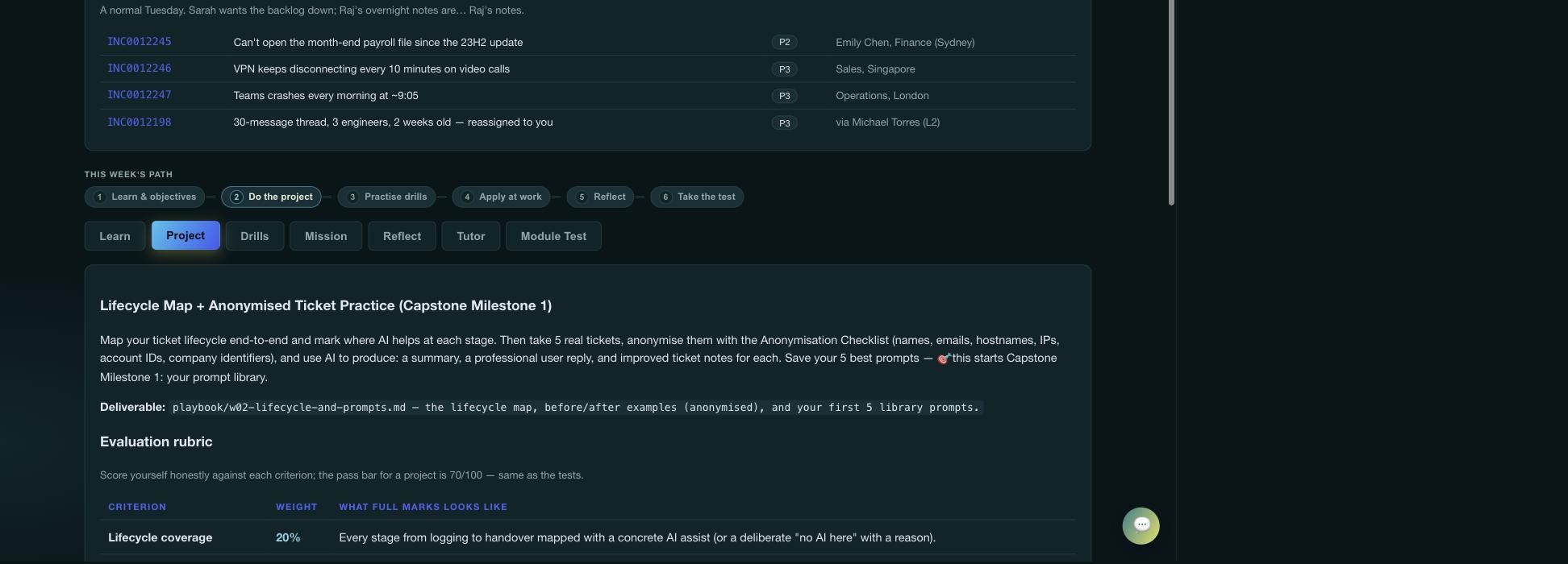
The module page showing a numbered 'This week's path' strip above the tab row
The path strip in place, with step 2 active. The tabs below it didn't change — what changed is that they now have an order, a position, and a finish line.
06 — Fix #2

Eight courses and no idea which one is yours

#2"Which path is for me?" — the role selector
The problem

The catalog showed eight cards of roughly equal weight and left you to work it out. For a returning visitor that's fine. For a first-time visitor — an L2 engineer with twenty minutes at lunch — it's a decision with no guidance, and the most common resolution to that is closing the tab.

This is the same problem Part 1's article had to solve in prose. It belonged in the product.

The fix

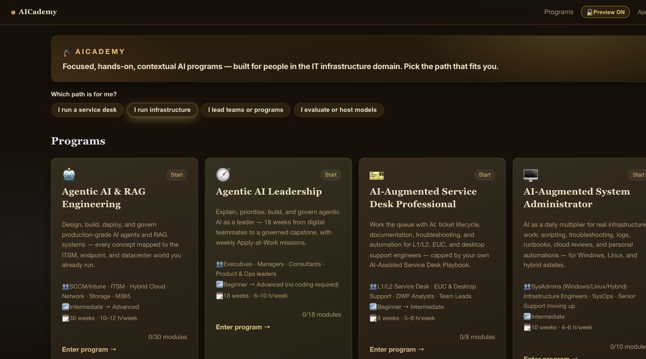
A strip above the grid asking one question: which path is for me? Four role chips — I run a service desk, I run infrastructure, I lead teams or programs, I evaluate or host models. Pick one and the matching courses are highlighted, the rest dim back, and a line of text gives you the sequence rather than just a match:

"I run infrastructure" → Begin with AI-Augmented Sysadmin, then go deep with Agentic AI & RAG Engineering.

That sequencing is the part that matters. Telling someone which two courses fit is a filter; telling them which to take first is advice.

Explainer · progressive disclosure

Progressive disclosure means showing people the smallest useful choice first, then revealing detail as they commit. Eight cards presented simultaneously is the opposite — maximum information, zero guidance, decision paralysis.

It's the difference between a museum handing you a floor plan of all forty galleries, and a greeter asking "first visit? Then start in room three." Same building, same exhibits — one of them you actually walk into.

Note what the selector deliberately doesn't do: it never hides the other courses. Dimming preserves your ability to disagree with the recommendation. Guidance that removes options isn't guidance, it's a wall.

The AICademy catalog with role chips above the course grid and 'I run infrastructure' selected
The role strip with "I run infrastructure" active. Recommended courses take a brass border; everything else recedes without disappearing.
07 — Fix #6

Graded against a standard you'd never seen

#6Worked examples — showing the standard, not just the rubric
The problem

Every project came with a detailed rubric: criteria, weightings, what full marks looks like. What none of them came with was an example of the finished thing. You were being asked to self-assess against a quality bar you had never actually seen — which is precisely the situation where a capable person under-rates their own work, or worse, doesn't start.

The fix

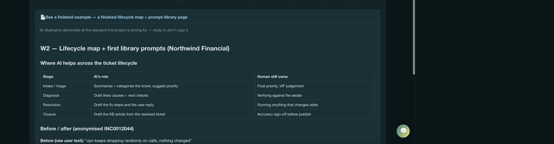
One worked deliverable per course, at finished quality, expandable inline on the project it exemplifies via "See a finished example." A service-desk lifecycle map with before/after ticket rewrites. A validated sysadmin script. A project charter and WBS. A model-sizing worksheet. Each labelled plainly: an illustrative deliverable at the standard this project is aiming for — study it, don't copy it.

The bonus fix

The artifacts leaned heavily on tables — and testing revealed the app's Markdown renderer didn't support them, so they'd have rendered as raw pipe characters. So the shared renderer gained table and blockquote support, which also quietly improved the study notes and anything written from here on.

Explainer · worked examples & the expertise gap

In education research the worked-example effect is one of the sturdier findings: for people new to a domain, studying a completed solution before attempting one produces better results than attempting it cold. Rubrics describe quality in the abstract; examples show it.

A recipe tells you "bake until golden." A photograph of the finished loaf tells you what golden means. Experts read the rubric and picture the loaf automatically — that's what expertise is. Novices can't, and a rubric alone quietly assumes they can.

An expanded worked example showing a lifecycle map rendered as a table
The Service Desk worked example, expanded — and rendering as a proper table, which it couldn't have done a commit earlier.
08 — The two I declined

What I didn't change, and why

Both declines came from the same instinct: a reviewer can see your code, but not your intent. Checking each against the actual codebase is what separates a real defect from a difference of opinion.

#4 · Declined

"Bring the RAG course to feature parity"

The finding read the feature keys but not their values. The flagship course has capstoneTracker: false, toolkits: false, no world file, and zero of 30 modules with a mission or reflection. It isn't switched on and broken — it's a 30-week engineering course built before those features existed, with a different shape by design. Retrofitting them would mean inventing missions for a course whose "apply at work" is the build. Left as-is.

#7 · Declined

"Tone down the steampunk catalog"

The argument — that a restrained, certification-grade look suits an executive audience — is a real one. But the brass catalog and dark course theme are a deliberate identity, and the trade is memorability for neutrality. Plenty of things compete on neutral. The visual identity is positioning, not a defect, so it stays. This article is themed after it.

"It's not built the way I'd build it" and "it's broken" are different findings. Only one of them is a bug.
09 — How the work was run

One commit per item, and one thing I couldn't do

The six changes shipped as six separate commits, in deliberate order: structural fixes first (scroll, empty states, lazy loading), then module UX, then catalog wayfinding, then content. Structural items first because they're cheap, low-risk, and carry most of the "this feels finished" payoff — the sort of thing you want landed before you start moving furniture.

Commit per item

Each change reviewable, revertable, and cherry-pickable on its own. If the lazy-loading work had misbehaved, it comes out without taking the checklist with it.

Riskiest flagged up front

The data-split was named as the highest-regression item before a line was written, not discovered as a surprise afterwards.

Verified what could be verified

Every file parse-checked, CSS balanced, renderer tested against all six artifacts including tables, blockquotes and code fences.

Honest about the gap

No production build ran. Everything was logic-tested, nothing was click-tested — so the whole batch carried a "build and click through before pushing" caveat.

Explainer · what "refactor" actually means

A refactor changes how code is organised without changing what it does. Nothing new appears on screen; the machinery behind it gets rearranged so future work is easier or faster. Rewiring a house without moving a single light switch — same switches, same rooms, tidier and safer behind the plaster.

Which is exactly why refactors are dangerous. Because the outcome is supposed to look identical, a mistake doesn't announce itself — it hides until someone walks a path you didn't test. That's why the risky half of the performance work waits for an environment that can build and run the app, and the safe half shipped now.

Cutaway of a wall: a calm finished brass panel with one light switch on the front, dense copper wiring being re-routed behind the plaster
A refactor in one picture: the switch on the front doesn't move. Everything behind the plaster does. Generated with Grok Imagine.
10 — What it added up to

Mostly, it stopped feeling unfinished

None of these six is a headline feature. Nobody enrols because scroll position resets correctly. But collectively they close the gap between a thing that works and a thing that feels built — and that gap is most of what people mean when they say a product feels professional.

The pattern that recurs across all six: each one removed a small moment of confusion. Not knowing where you are on the page. Being offered a door to an empty room. Waiting on a download you didn't need. Not knowing which tab comes next, which course is yours, or what "good" looks like. None fatal on its own; together they're the difference between a learner returning on Thursday and not.

A code review is a gift with a cost: it's right often enough that you have to check every time it isn't.

Still on the list: the async registry refactor that defers the remaining ~1.1 MB, which needs a build-capable session and a proper click-through. It's written up as a spec rather than left as a memory — the difference between a roadmap item and a regret.

▸ See the result ← Read Part 1: the project